Loading

weekend4two

Bringing weekend4two to the mobile age

Background

In 2012 we modernized the popular Swiss getaway portal, weekend4two, in 2012. To our delight, this project, in addition to achieving measurable gains in engagement rates, won the bronze distinction in the technology category of the Best of Swiss Web Awards in 2012. Three years later, we were invited to extend our redesign of the website, focusing this time particularly on the user experience on mobile devices and tablets. On one hand, the user experience and booking process for existing customers needed to be simplified and improved in this larger redesign, while on the other, the website needed to be more alluring to new users. In addition, much of weekend4two’s revenue comes from customers purchasing gift certificates, this section of the website needed to be more prominent and the ordering and customization process more streamlined.

Challenge

Before we completed our first round of modernizations for weekend4two, the website had been rather haphazardly expanded without a clear plan or style as weekend4two itself organically expanded. Then, our task was to translate the character of the old website into a new design and simplify complicated processes using new technologies without upsetting its growing loyal customer base. In the second round of modernizations, these challenges remained as we expanded and unified the website and created a complementary user experience on mobile devices, but we also wished to take advantage of the growing amount of user data that weekend4two had at its disposal and what they had learned about their customers over the past years in business. This required the at we design and test new inclusive user interface patterns and style guidelines that could be applied to new areas of the site and social marketing efforts by weekend4two’s internal team.

Solution

By purifying and opening the design of the weekend4two website, users were once again able to easily transition from one version to another and weekend4two prepared for the next stage in the company’s growth. A clear framework and navigation makes it easy for users to find just the right package that meets all their requirements. Cuddly romantic escapes, relaxing spa weekends, or entertaining city trips are only a few clicks away.

Inviting Design

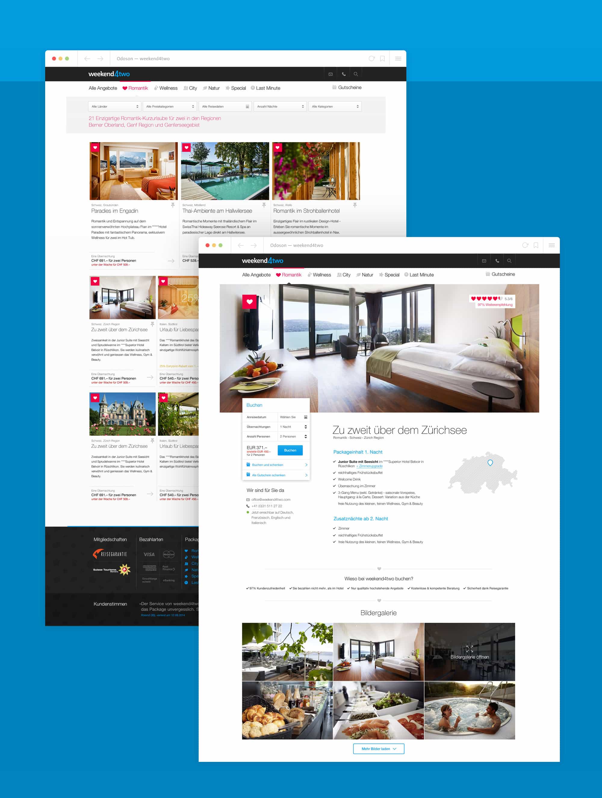
The new look for weekend4two invites the user to browse through the various offerings at his or her leisure. A well-organized landing page helps first-timers find their feet in the new look and each detail page is clearly structured with beautiful preview pictures. A versatile page structure and big preview images highlight the of quality one can expect from the service while luring visitors to hunt for their own perfect getaway. It was important that potential customers know exactly how to proceed if they decided to book a given package, so the booking area is placed prominently in the upper left corner.

Iconography

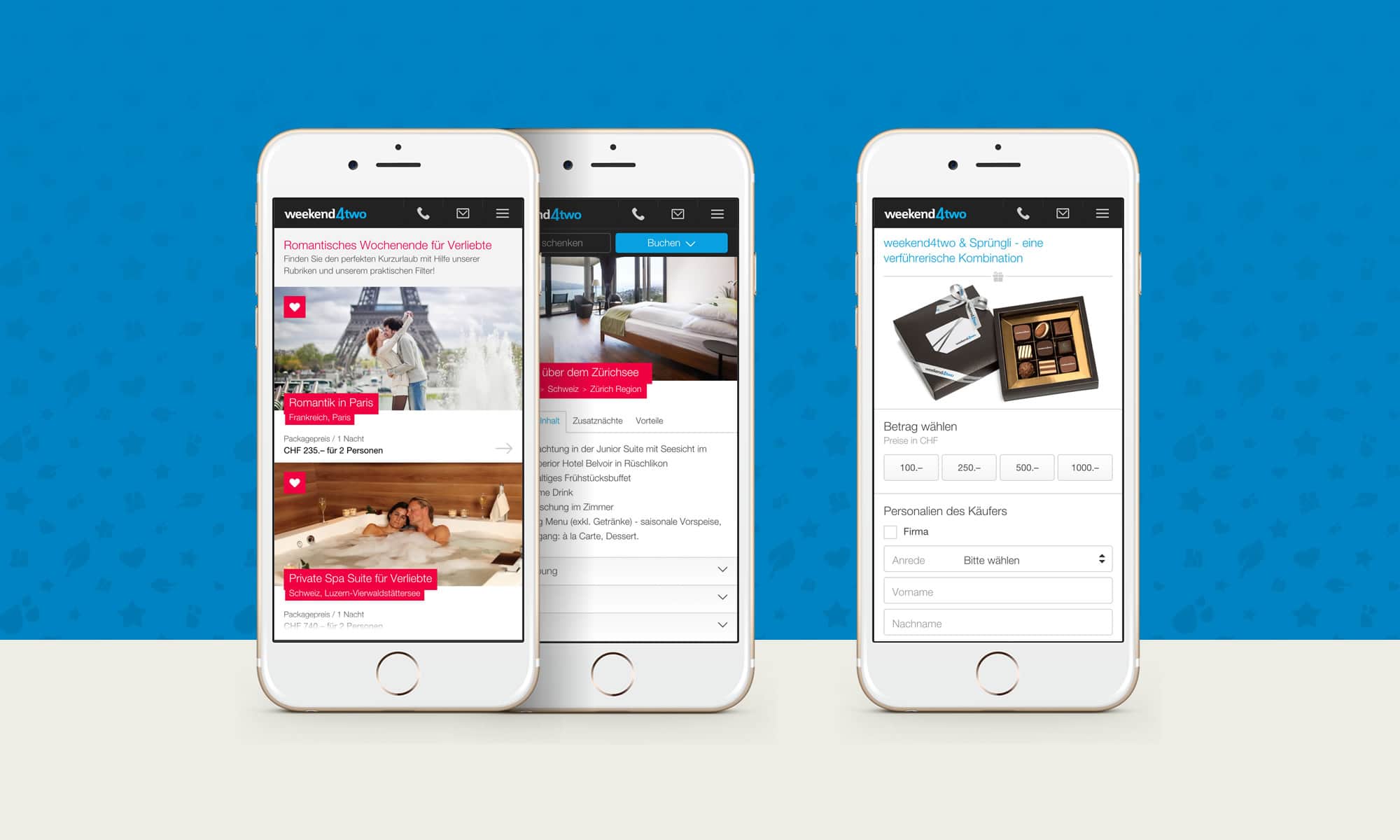
Friendly and colorful icons organize weekend4two’s offers into broad categories and help visitors navigate through the site to find their ideal getaway.

Gift vouchers

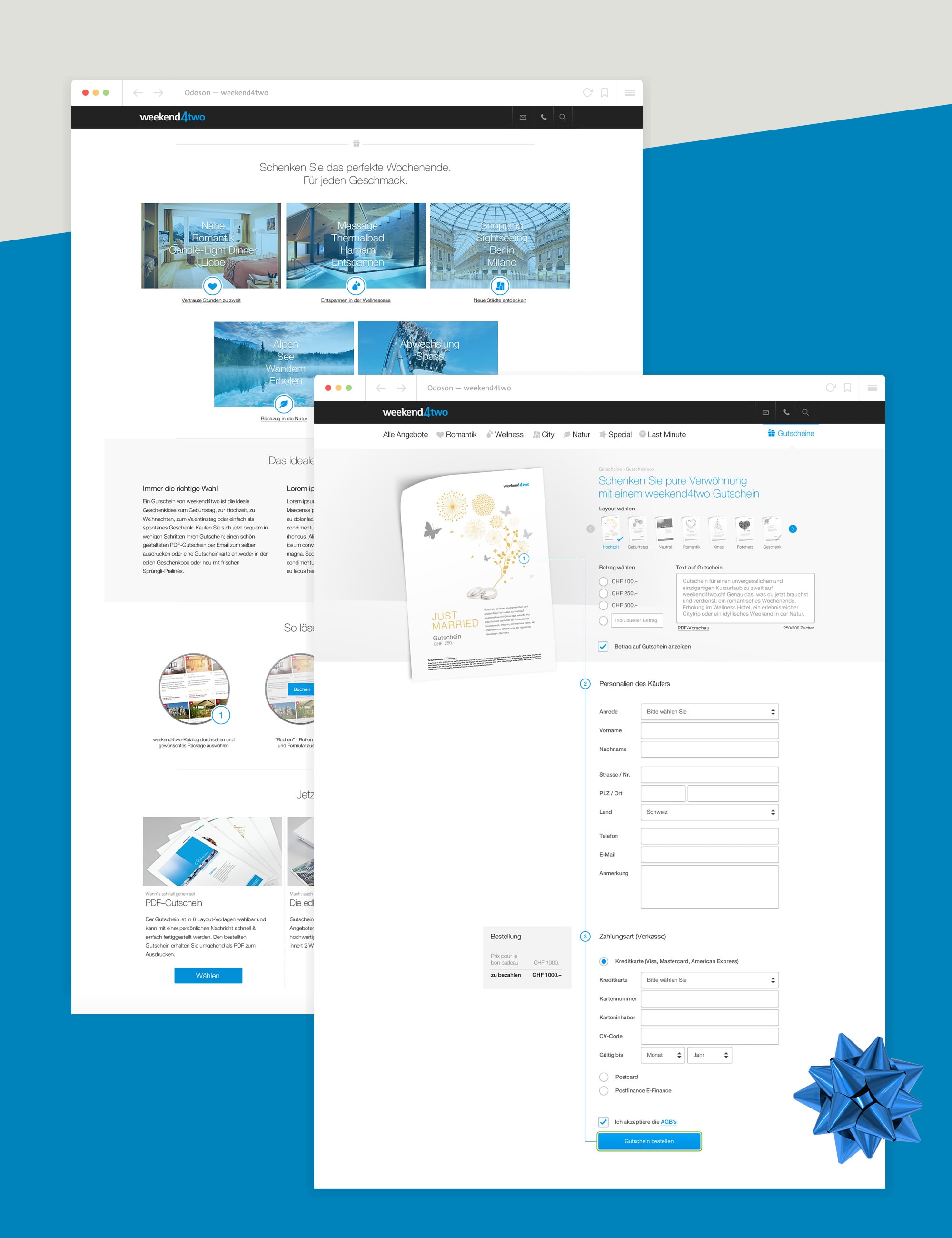
The sale of gift vouchers is a large part of weekend4two’s revenue. As such, the voucher section needed to perform at its best. We set up the voucher section so that it would not distract with anything but the process of customizing and ordering the voucher. Users can instantly preview on how the final product will look and can download the finished voucher at the end of the process, making weekend4two gift vouchers an ideal last minute gift that suits nearly every occasion.

Home