Sound-Proof
Bringing a technology start-up to life

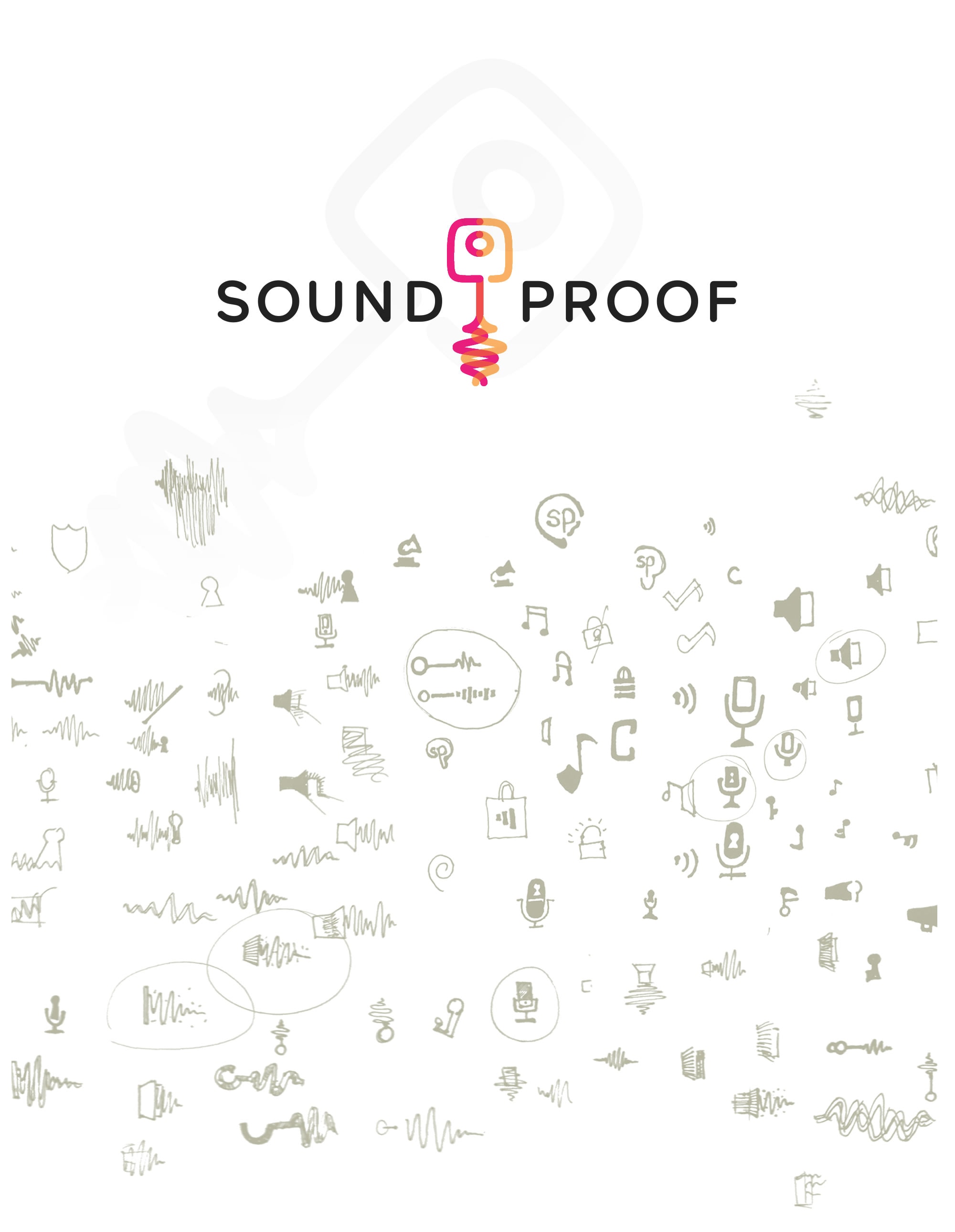
Logo Development Process
The finished logo at the very top is the result of an extensive process of research, (roughly) sketching out new ideas, refining them and doing it all over again. The logo we finally created is a representation of the two sound waves that are compared to each other when a user tries to sign in using Sound-Proof. These waves then come together and take the shape of a slightly abstracted key, a common symbol for security.

On the Web
The website is an extension of this visual language and gently introduces the user to Sound-Proof and two-factor authentication as they scroll down, without overwhelming with technological jargon.

Crisp Explainer Video
We developed a crisp, compelling 2D animation that mirrors the straightforward process of Sound-Proof. Both style and story have been reduced and are presented in a clean and minimal way.

