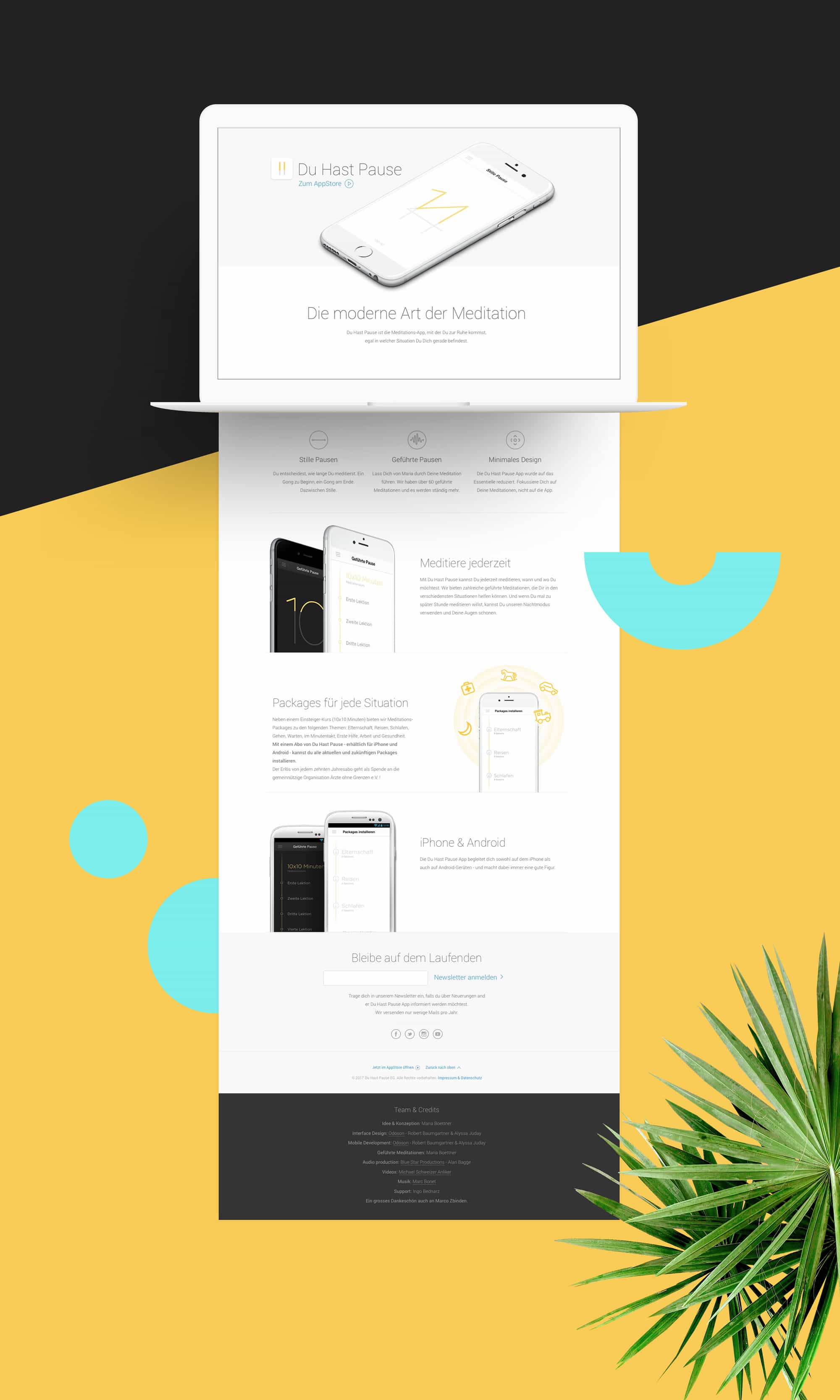
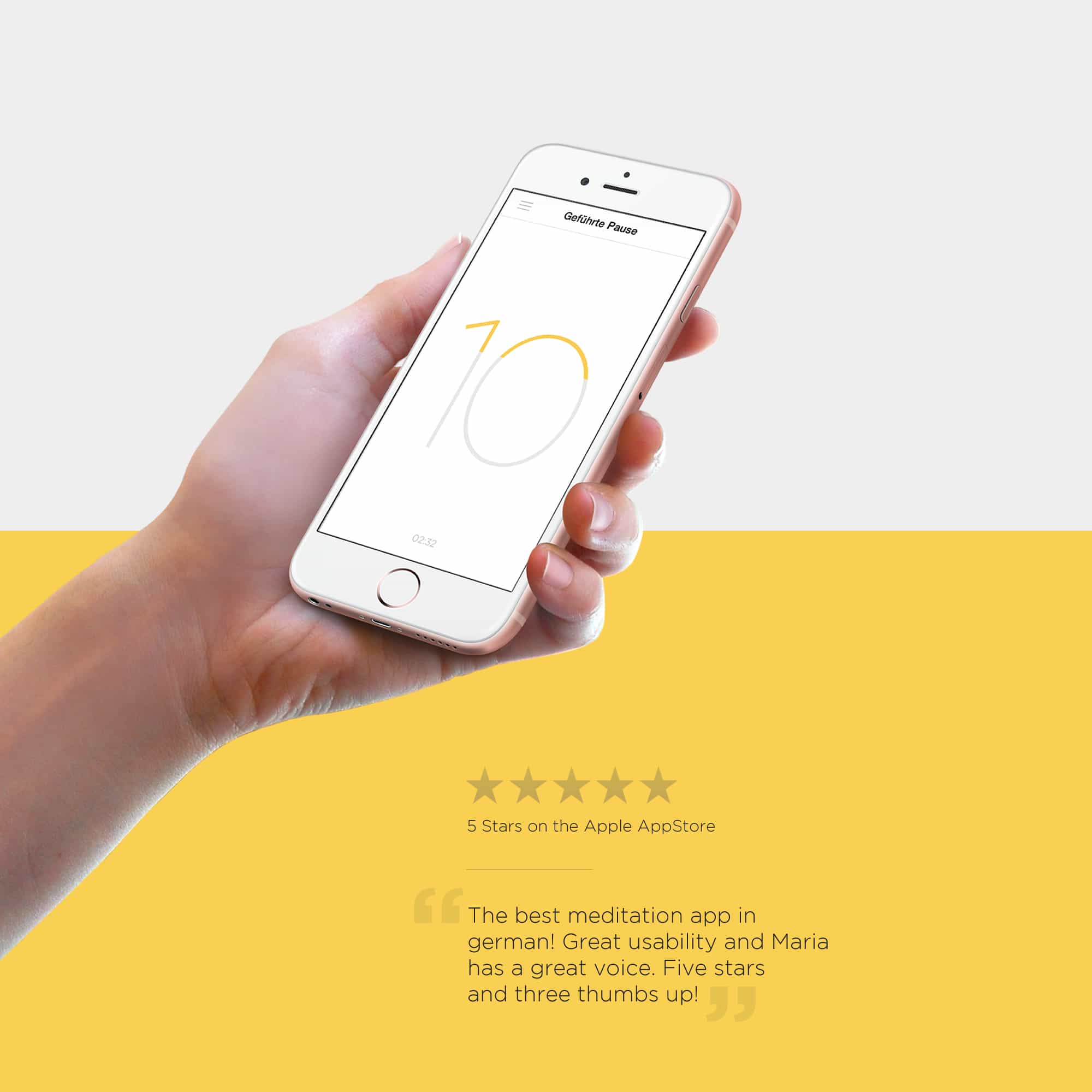
Loading

Du Hast Pause

A new meditation experience

Background

With the “Du Hast Pause” (roughly translated from German into English as “Time to Pause”) application, meditation instructor Maria Boettner wished to share with others the joy she has found in meditation and her experience bringing mindfulness into daily life. She has a blog and Youtube channel with the same name as the application, and wanted to unify the experience of these channels and have a plan where the content on each complemented the other channels.

Challenge

Du Hast Pause was conceived of as a way of providing provide both new and existing followers of Du Hast Pause with an easy, useful tool they could use to learn more about meditation, practice techniques, and unfold the openness of the mind and heart through meditation. In order to achieve this, Du Hast Pause needed an interface that was simple and not only didn’t interfere with the meditative process, but in addition would help the user to get past the largest obstacles for meditation – those in his or her own mind – and look beyond for a more meaningful life.

Solution

The structure of the application has been reduced to that which is most important for busy users looking for a simple way to meditate. The interface is calming, and not only doesn’t distract from the goal of Du Hast Pause, but also in fact fosters the proper mindset for a successful meditation experience. A day and night mode subtly changes the colors of the application so that it blends in with the time of day at which users choose to meditate. In addition, the timer doesn’t rely on the oft-used pie timer, which emphasizes counting down the minutes until one is finished meditating. Instead, a graphic of the number of minutes chosen to meditate slowly fills with color as the meditation session proceeds, putting emphasis on the process and experience of meditating.

The App Icon

Being a stylized pause symbol, the app icon for Du Hast Pause is simple, iconic, and connects to what the actual app offers. It also stands out amidst a cluttered app screen and makes a great first impression in the iOS App Store and the Google Play store, giving potential users a glimpse of the overall style and quality of the Du Hast Pause app.

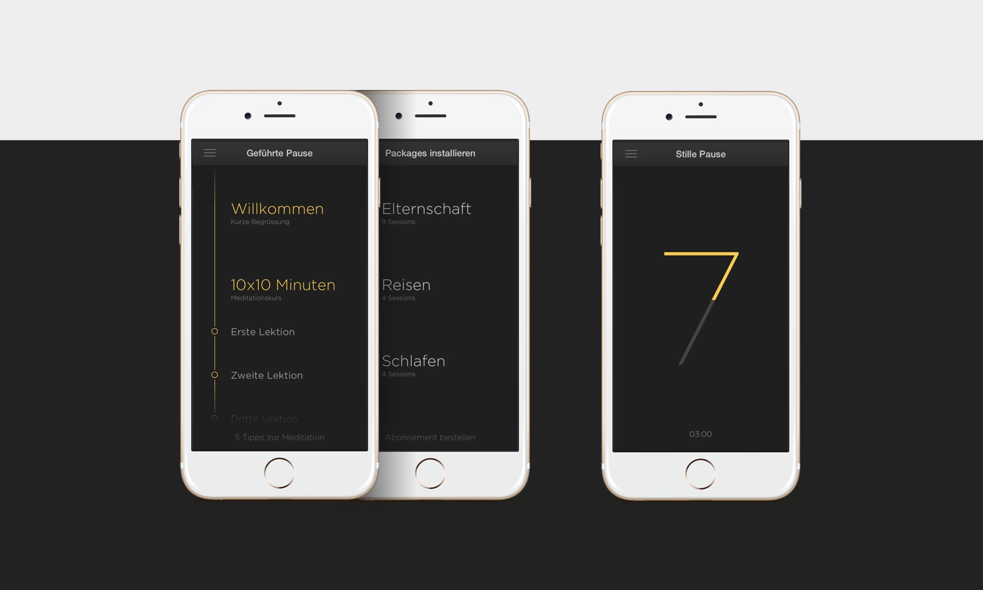
Easy on the eyes, even at night

The integrated night mode greatly increases the comfort of using the app at night or in dimly lit rooms. Instead of a bright white screen, the user interacts with a complementary interface of dark colors that don’t disrupt the moment. The app, as always, steps aside to put the act of meditating at the center of attention.

Apps on your mind?

Let's chat
Home