So Vegan, an LA-based cold-pressed juice and smoothie bar and delivery service, came to Odoson for a complete overhaul of its branding. The market for healthy foods and fresh juices in the Greater Los Angeles area was becoming increasingly saturated, and So Vegan wanted to differentiate itself from other providers and expand its presence with a new, friendlier, and more vibrant visual language.
Challenge
Knowing So Vegan’s dedication to having the freshest, best ingredients in order to make a delicious product, the branding needed to also to convey to customers the quality of the fruit and the careful process that goes into making every glass or bottle of fresh juice good for you and delicious at the same time.
Solution
The new branding for So Vegan indeed focuses on the fruit through overall hierarchy of the branding elements. A simple, slick logo for So Vegan embodies the healthy, yet carefree California persona of the brand and serves as a great backdrop to the other elements of the brand. In this manner, loose outline drawings of the fruit and vegetable ingredients in So Vegan’s recipes show what is in So Vegan’s juices. Bold, bright colors serve to distinguish the various flavors available from each other. The packaging style can be easily modified for each new flavor So Vegan unveils, and can be later expanded to its delivery trucks, stands, and store interiors.
Year
2014
Deliverables
Graphic Design, Product Design, UI Design, Development
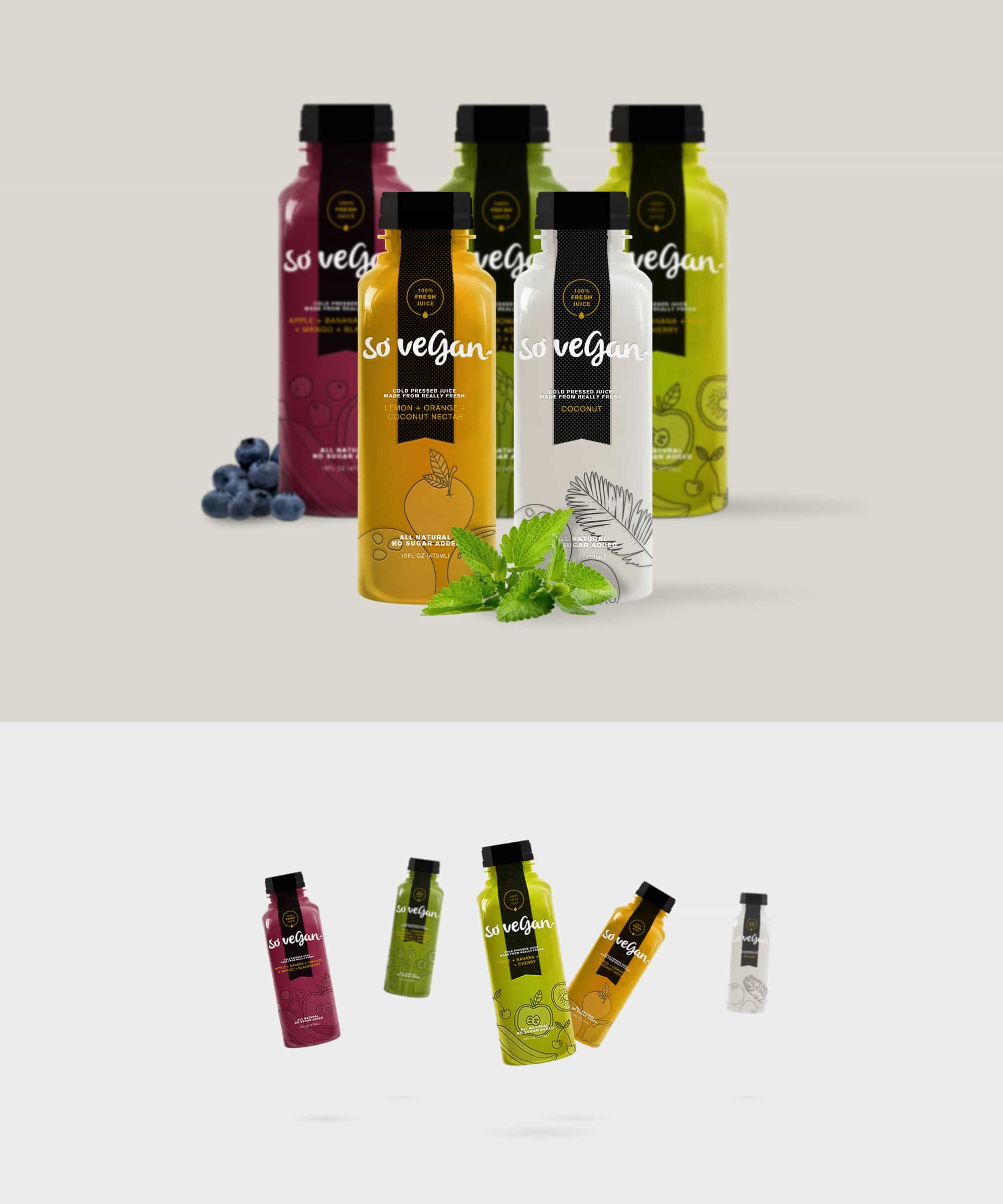
Let's get to the essence of your brand
Try us out for your next project and see for yourself the difference our design-based approach makes to organizations looking to innovate and grow.