Loading

Norman&Page

Redefining the Florida Real Estate Experience

Background

Seeing a lack of adaptation to contemporary ways of thinking and working in their market, Norman&Page, a new real estate agency in Florida, wanted a complete identity that embodied the progressive philosophy and authenticity of the company. The branding needed to seem modern, but at the same time established, serious, but personable, speaking to both the target clients – newly affluent millennials – and the team of Norman&Page.

Challenge

In its area, the newly-found Norman&Page was set to compete with several large, well-known real estate and development agencies – a tough battle for a small maverick firm. As part of its overall strategy to establish itself and gain credibility, Norman&Page needed a branding that gave it both an instant history and an approachable face, without resorting to any of the tired visual tropes commonly used in the industry.

Solution

We created a modern and reduced visual language for the Norman&Page brand, with an abstracted seal logo inspired by the surrounding Florida landscape anchoring its new identity. A new, responsive website for Norman&Page showcases the restrained visuals that make the brand powerful and elegant. Visitors to the website are able to explore possibilities for their future home and narrow down their options through a series of targeted lifestyle sections. Friendly, custom-animated icons for each lifestyle section complement the more serious aspects of the design and leading to a more authentic image of Norman&Page as more than just facilitators, but trusted advocates for their clients throughout every step of the home buying or selling process.

Palms of Florida

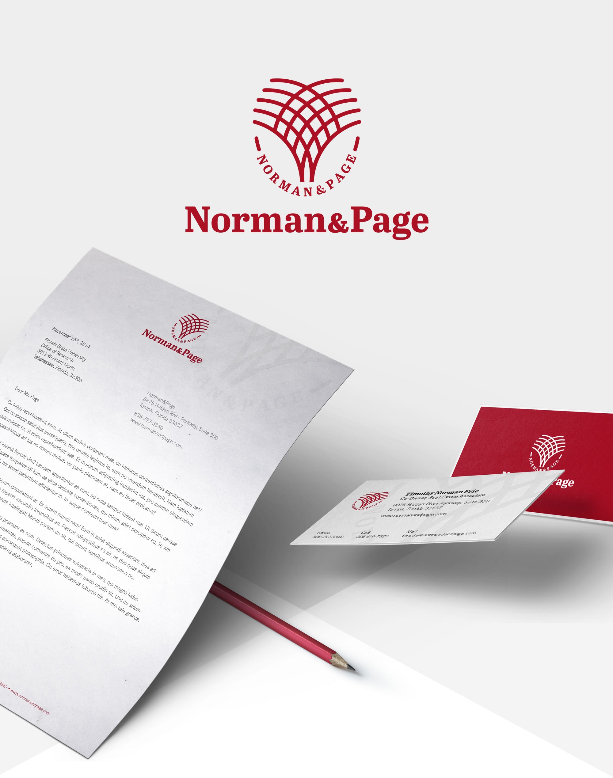
The mark is an abstraction of the palm trees one has come to associate with Florida property, especially the lush gardens of luxury homes such as those for sale by Norman&Page. This minimalist treatment of the logo is timeless and gives an air of credibility and seriousness to the new real estate brand, while the somewhat playful typography makes the brand more approachable and personable.

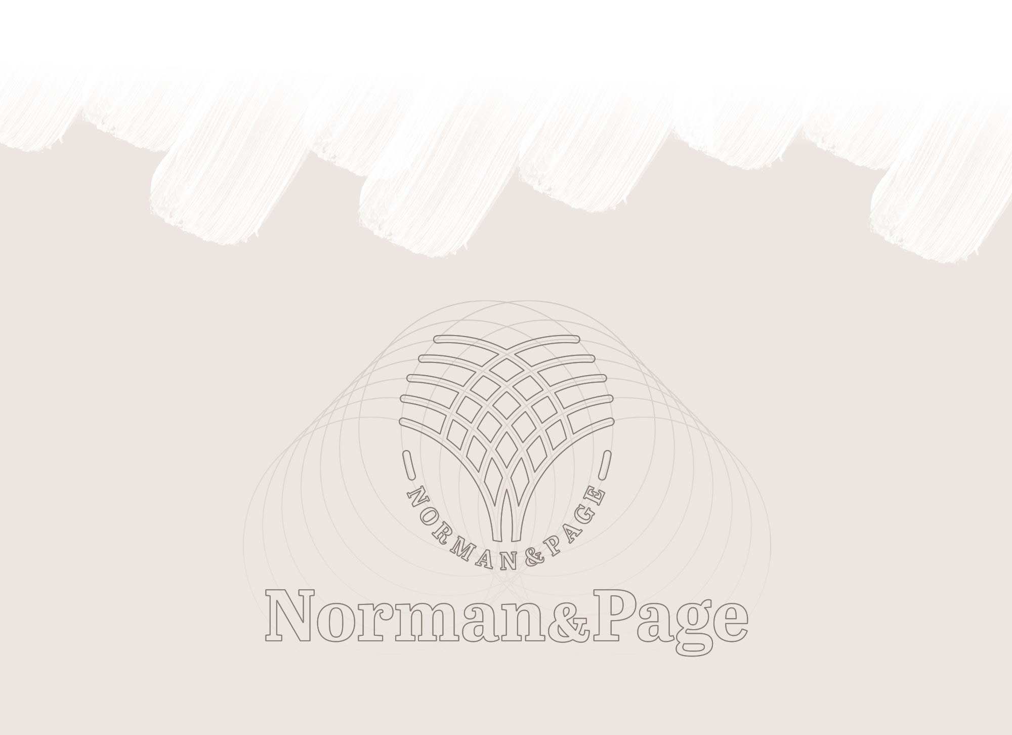
Minimalist Construction

The final logo mark of the abstracted palm tree was constructed using fourteen equally overlapping identical circles. This repetition creates a calm, balanced, and minimalist look.


Have a project you want to discuss?

Let's talk
Home